Share this article:
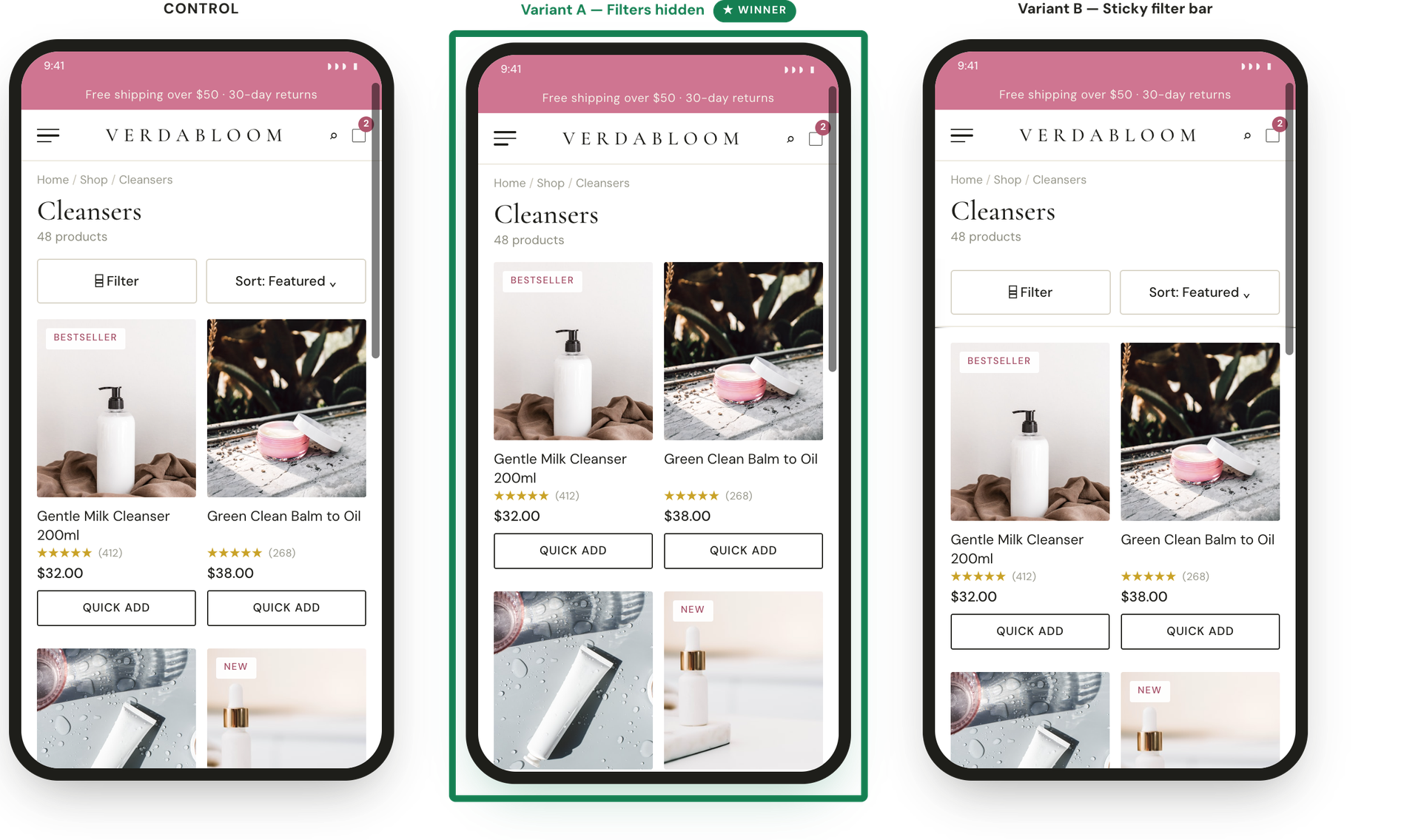
On a skincare brand's mobile collection page, a filter and sort bar consumed valuable screen space at the top of the product grid before scrolling out of view, yet less than 1% of visitors ever interacted with it. To address this “wasted” real estate, this experiment set out to test whether shoppers actually needed the filter bar at all, or if making it a sticky bar (keeping it permanently visible and easy to tap as they scrolled) would make it more convenient to use.
Hypothesis: If we change the mobile filter bar, either by hiding it to prioritize products or making it sticky to increase usability, shoppers will find products faster and buy at a higher rate.
What we A/B tested:
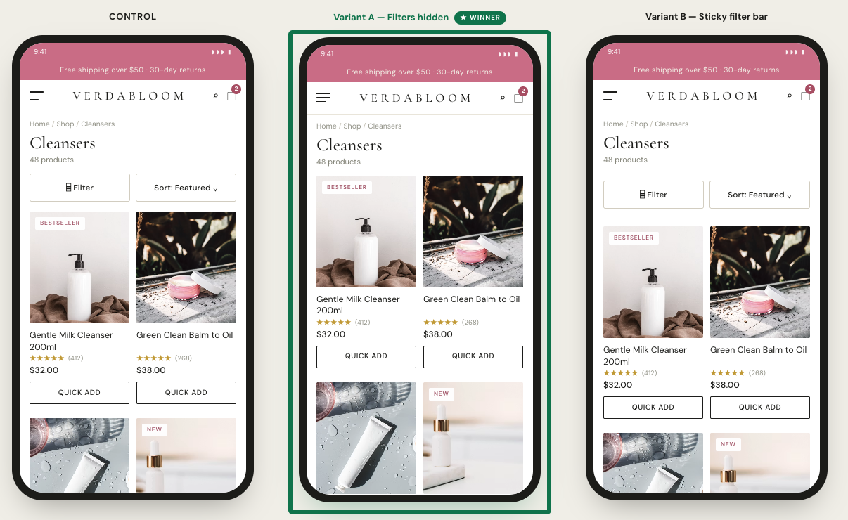
The winning variation: Completely hiding the filters won over both the original layout and the sticky bar. Making the filter bar sticky failed to increase engagement, shoppers still didn’t use it that much, meaning it simply locked permanent clutter onto a small screen. Hiding the controls gave prime viewport real estate directly back to product tiles, directly increasing the clicks on a PLP product by over 5%, increasing the discovery for the vast majority who never used filters anyway.
The impact:
- +5.0% purchase conversion
- +12.5% revenue per visitor
- +5.4% add-to-cart clicks
Takeaways:
- Test removing low-usage features. When a tool has extremely low engagement, making it more visible can just lock clutter onto the screen, hiding it entirely might be a better solution that yields better results.
- Removing clutter improves multiple metrics at once. Clearing screen space helped shoppers find items faster, which boosted both overall conversion (+5.0%) and revenue per visitor (+12.5%) without any downside.