Share this article:
On a mobile homepage for a jewelry retailer, the hero banner covered almost the phone screen. The primary calls to action, buttons linking to the top product categories, showed very low engagement: only about 1 in 7 visitors clicked any of them. Since the banner took up so much vertical space, nothing below it was visible above the fold. We tested whether reducing the hero height to expose the content below it would get more visitors into the catalog.
Hypothesis: If hero calls to action are easier to reach and the next homepage section is visible on load, more shoppers will tap the main entry points and explore the catalog.
What we A/B tested:
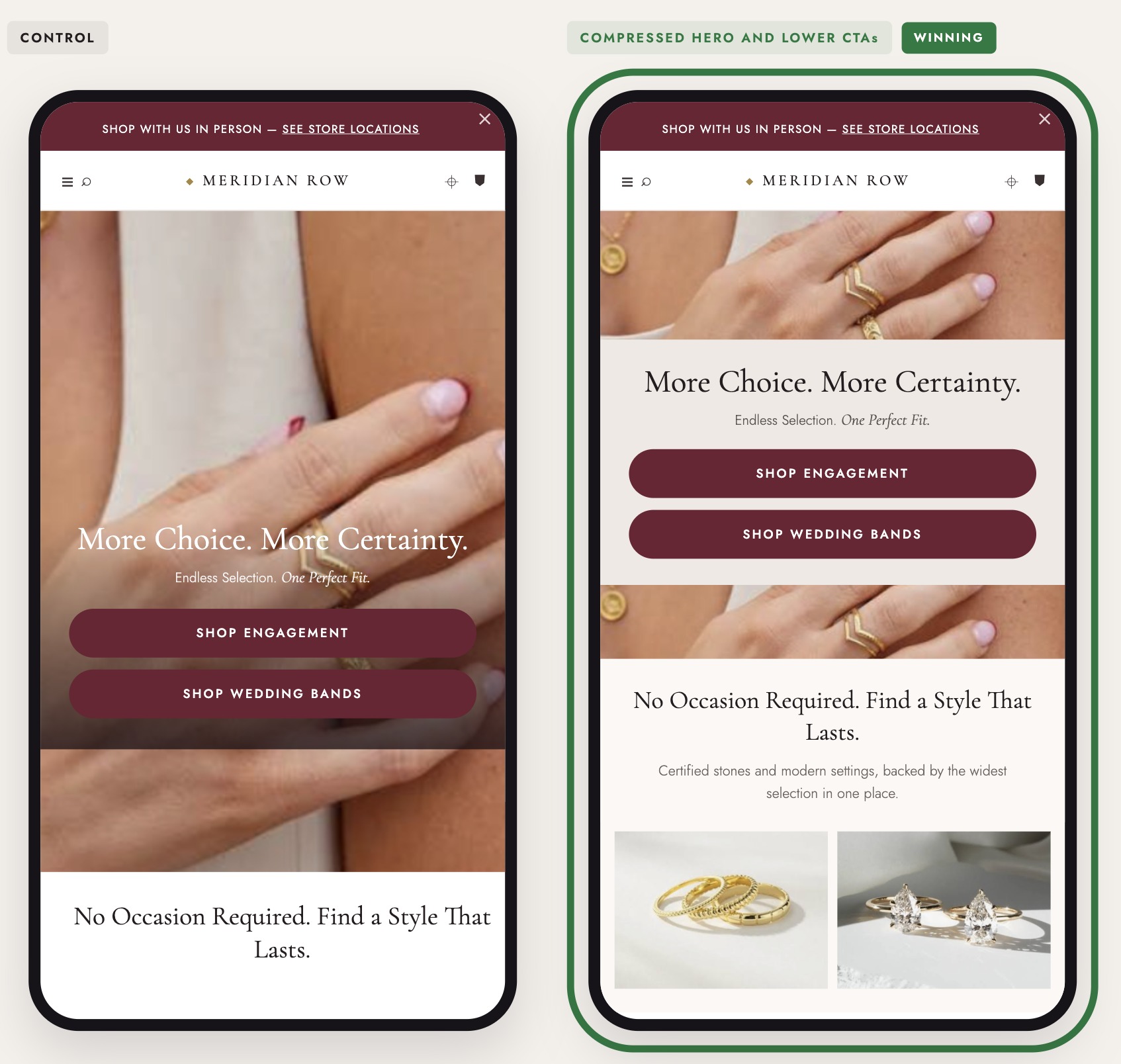
The impact:
- +6.4% reached category pages
- +3.6% reached filtered listings
- +13.1% reached cart
Takeaways:
- Exposing below-the-fold content creates a visual hook. Letting the next section peek up signals that more content exists below, encouraging shoppers to keep scrolling and explore deeper (+6.4% category page visits).
- Reducing hero height increases primary CTA engagement. Eliminating screen-swallowing hero banners makes top entry buttons immediately visible, driving higher interaction (+21.5% hero button clicks).
.jpg)