Share this article:
For this brand, which drives a lot of its traffic using a popular blog, blog visitors showed initial interest but making them move from “blog reading” mode to “product discovery” mode proved to be a challenge. The top of the page suffered from heavy visual clutter: a promo bar, menu icon, cart icon, and a category row that disappeared immediately once visitors scrolled down the page. This behavior left readers without a persistent path to the product catalog as they moved down the page. We tested whether simplifying the header and pinning essential category navigation in the viewport would drive more readers into product and category pages.
Hypothesis: If we simplify the blog header to core navigation elements and keep the category menu visible while scrolling, more readers will understand what the site offers and transition into the catalog.
What we A/B tested:
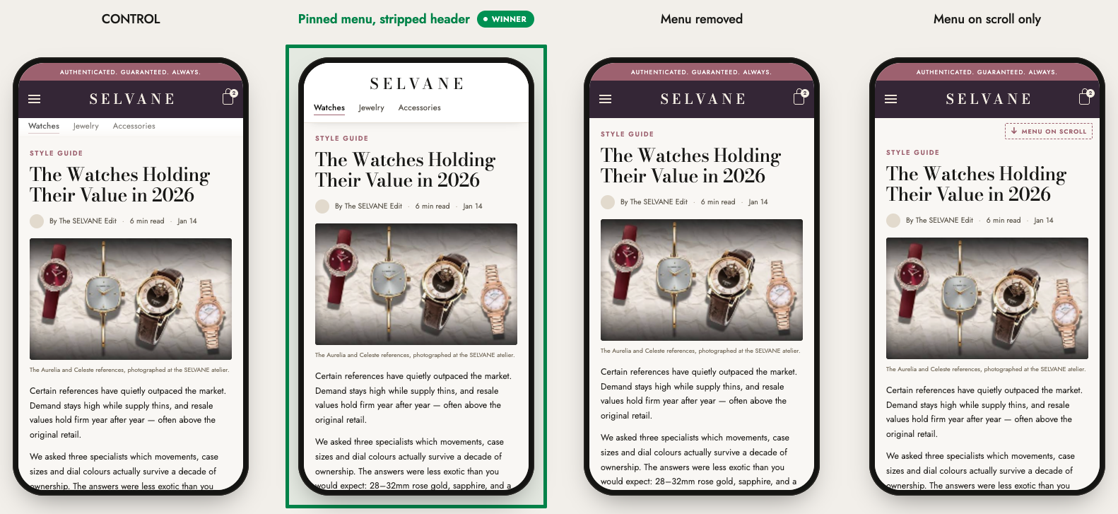
The winning variation: “Sticky Simplified Header” won. The top two performing versions both featured a pinned header that stayed visible during scroll. This demonstrates that continuous access to primary navigation actions is critical for helping readers transition into the catalog whenever interest strikes.
The impact:
- +10.5% product page visits (PDPs)
- +9.1% listing page visits (PLPs)
Takeaways:
- Informational pages require clear commercial exit paths. It takes real effort to get readers to “convert” into potential buyers. Simplifying header choices and keeping category links persistent makes the transition from reading to browsing products effortless.
- Sticky positioning matters more than removing or keeping links. Keeping core navigation fixed in the viewport removes scroll-back friction, which proved far more impactful than completely removing the menu or making it slide in and out on scroll.