Share this article:
1. A Wasted Above the Fold
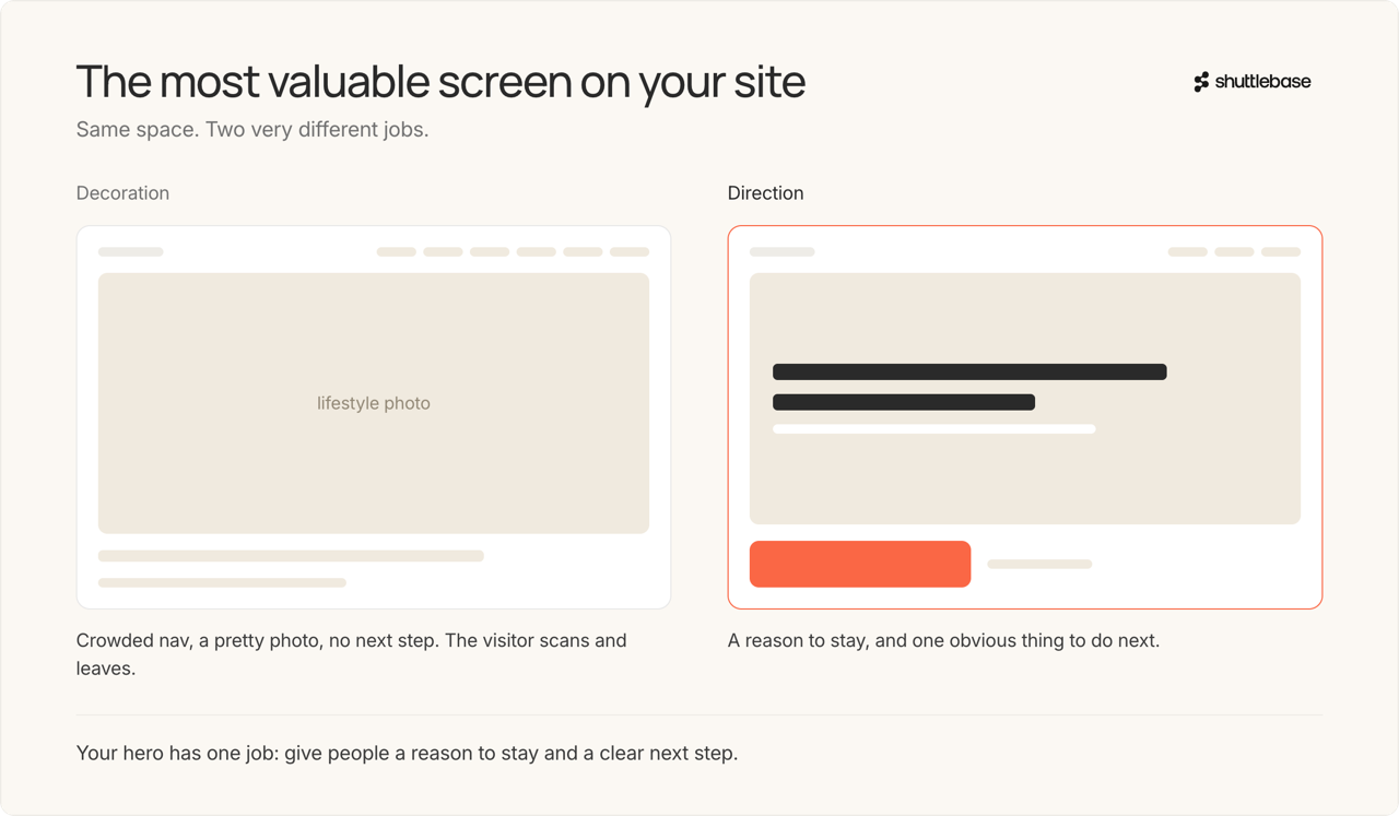
The above-the-fold area is the most valuable space on your entire site. It is the first impression someone gets about your brand, and it sets the tone for whether they keep shopping or bounce. So why do so many sites waste it? We see cluttered navigation bars that overwhelm instead of guide. Hero banners with a pretty lifestyle photo and no call to action. Headline text that says everything about the brand and nothing about what the visitor should do next. The result is a visitor who lands, scans, feels nothing pulling them forward, and leaves.
Your hero section has to give people a reason to stay and a clear next step. If it doesn't do both, it is decoration, and decoration doesn’t always convert.
2. No Obvious Way to Start Shopping
This sounds almost too obvious to mention, but we see it CONSTANTLY. A visitor lands on a site, likes what they see, and then has to figure out how to actually start shopping. The path is buried in a hamburger menu, hidden behind a "Shop" link that blends into the nav, or scattered across category pages with no clear entry point.
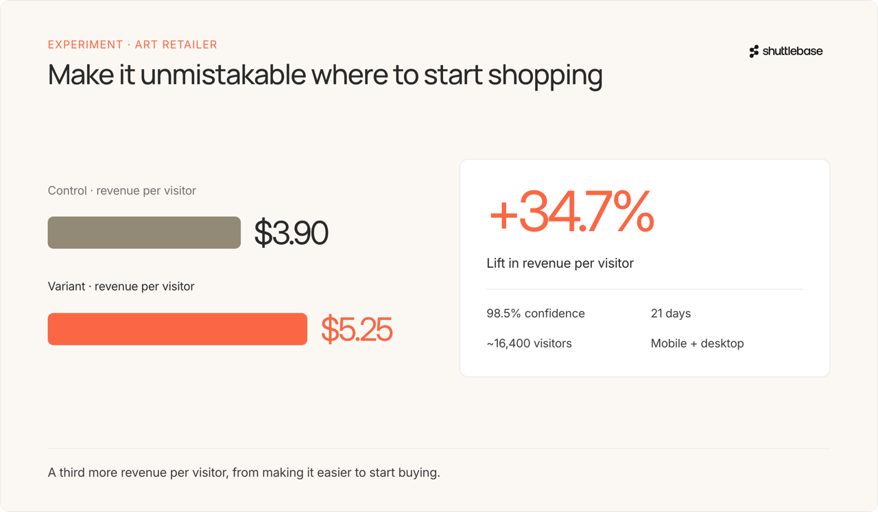
We ran a test for an art retailer whose mobile homepage had a rotating carousel that looked nice but gave visitors no clear next step to shop. We replaced it with a search bar front and center, with the top search terms as scrollable chips right below it to give buyers an easy way into the site. Witht his change, revenue per visitor went from $3.90 to $5.25. That’s a 34.7% lift at 98.5% confidence over 21 days and roughly 16,400 visitors. All they did was make it easier to start buying.
3. No Sticky Call to Action on Mobile
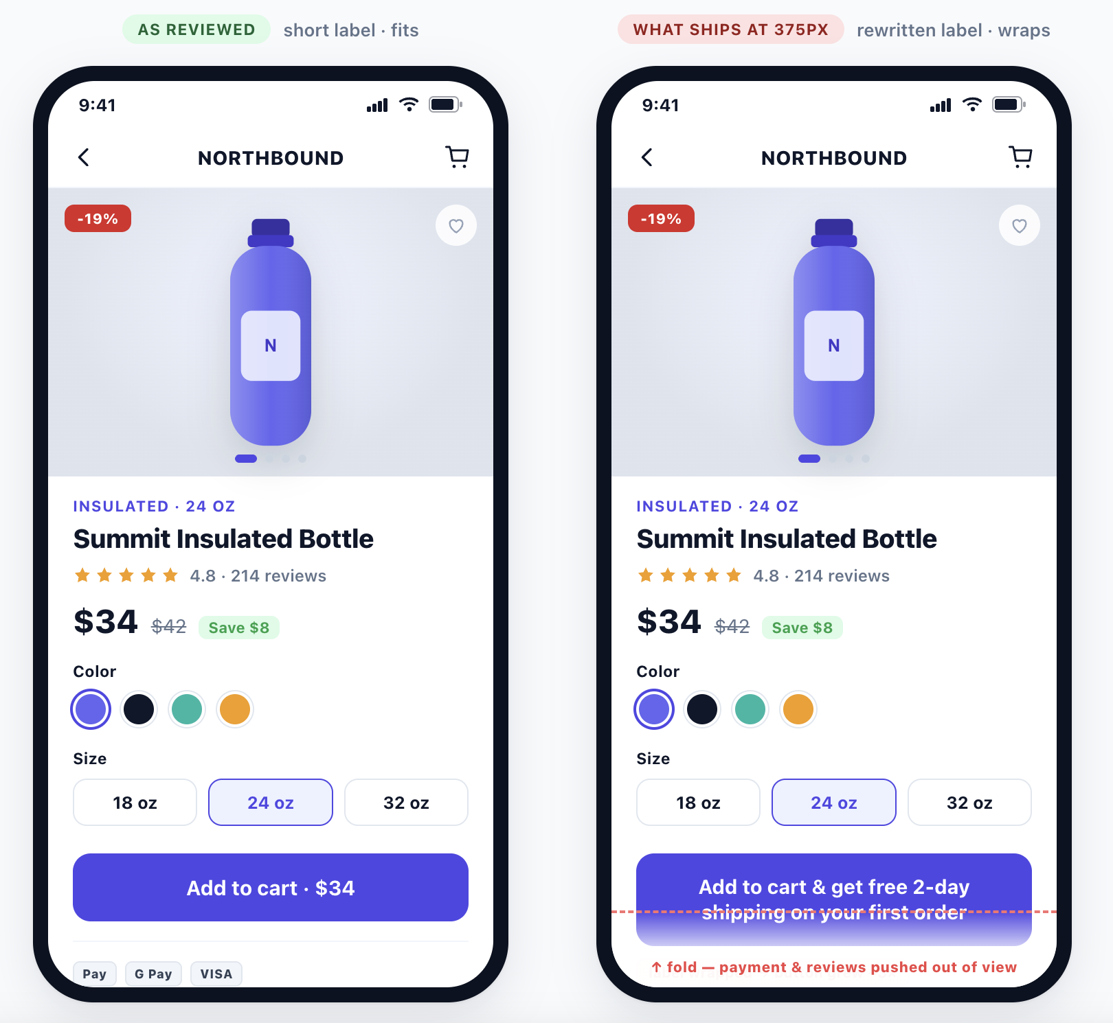
On desktop, your add-to-cart button is usually in a visible spot on the page. On mobile, as soon as a shopper scrolls past it, it’s gone. They’re busy reading reviews, checking product details, looking at images - and when they decide to buy, they have to scroll all the way back up to find the add-to-cart button. Sometimes, buyers won’t even go back to look for it.
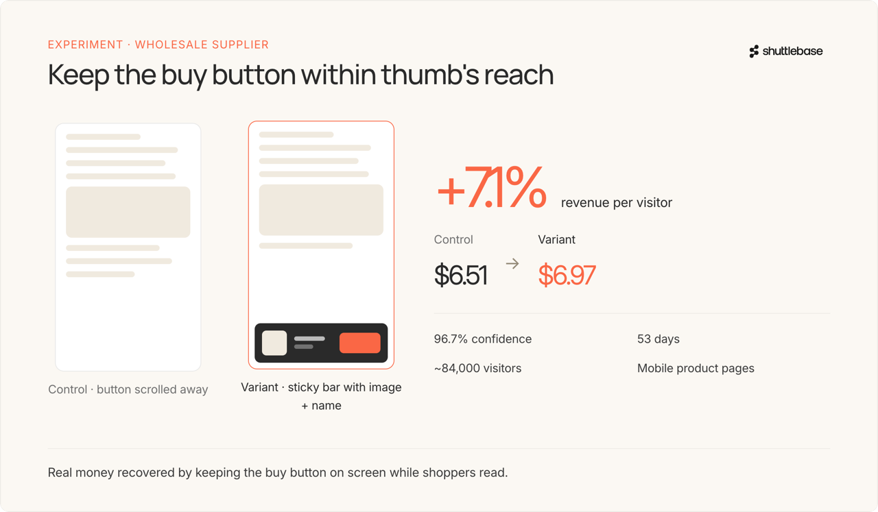
We tested this for a wholesale supplier we work with. We added a sticky add-to-cart bar on mobile product pages that kept the product image, name, and button visible as the shopper scrolled. After making this change, revenue per visitor went from $6.51 to $6.97- a 7.1% lift at 96.7% confidence over 53 days and roughly 84,000 visitors. That is real money recovered simply by keeping the buy button within thumb's reach.
4. Zero Cross-Selling (or Cross-Selling Nobody Sees)
Most sites either have no cross-sell at all, or have one buried so far down the page that nobody ever sees it. The fix isn’t always adding something new. Sometimes it’s making what you already have visible.
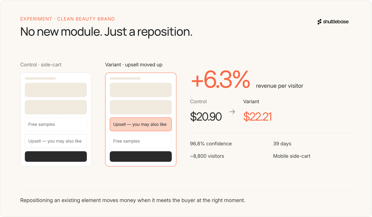
We ran an experiment for a clean beauty brand where the only change was moving their existing upsell section higher in the mobile side-cart, above the free-samples slot. That is it, just a reposition. Revenue per visitor went from $20.90 to $22.21 - a 6.3% lift at 96.8% confidence over 39 days and roughly 8,800 visitors. Repositioning an existing element put the offer in front of the buyer at the right moment.
5. A Checkout That Fights the Buyer
Checkout is where intent is highest, and friction is most expensive. Someone who reaches checkout has already decided to buy. Your only job at this point is to not give them a reason to leave. And yet so many checkouts do exactly that. Shipping costs show up as a surprise at the last step, mandatory account creation before you can pay, form fields that ask for information the buyer doesn’t understand why you need. Every unnecessary field and moment of confusion is a chance for the buyer to pause and reconsider.
The best checkouts feel like a downhill slide. The worst ones feel like a job application. If your checkout has more friction than your competitor's, your competitor gets the sale. It really is that simple.
Why These Five Things Come First
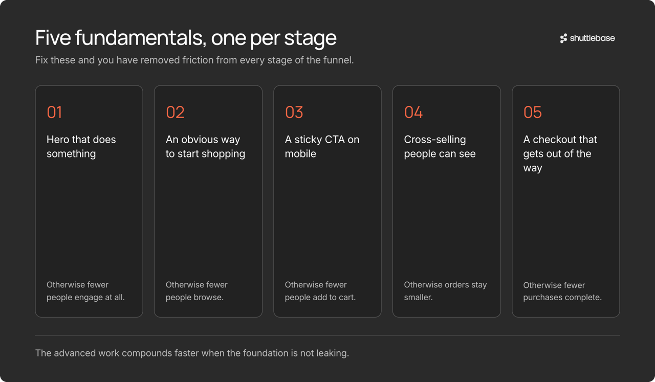
None of these are advanced optimization tactics. They are website fundamentals, which is exactly why they matter so much. A wasted hero section means fewer people engage. No clear shopping path means fewer people browse. No sticky CTA means fewer people add to cart. No cross-selling means smaller orders. A hostile checkout means fewer completed purchases. Fix all five, and you have removed friction from every stage of the funnel - before you even start running experiments on messaging, pricing, or page layout. The advanced work compounds faster when the foundation isn’t leaking.
Our team at Shuttlebase has helped many, many brands understand their website’s gaps and launch continuous testing programs to fix them. If you would like to see how we can help you and your brand convert more shoppers into customers, request a free demo here.