Share this article:
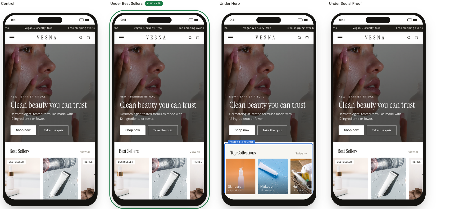
On a clean-beauty retailer's mobile homepage, shoppers frequently bounced without ever viewing a product page. The site's original layout relied heavily on a broad hero banner and hidden hamburger menu navigation for category discovery, creating top-of-funnel friction that decreased visitor exploration. This experiment tested introducing a visual “Top Collections” carousel at different scroll depths to give high-intent visitors an immediate, on-page path to popular categories.
Hypothesis: If we add a visual “Top Collections” carousel to the mobile homepage layout, visitors will find popular categories faster, increasing product page views and overall purchase conversion.
What we A/B tested:
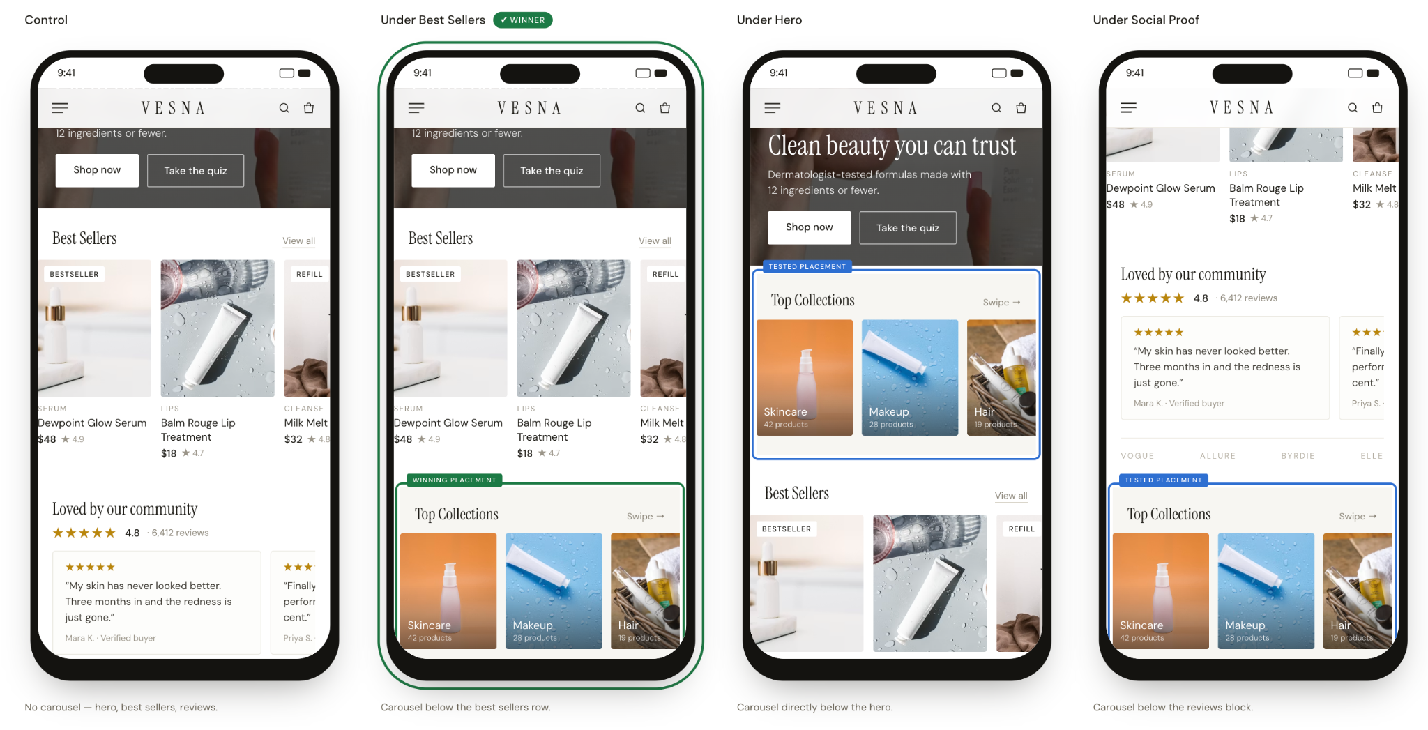
The winning variation: “Under Best Sellers” variation won by intercepting shoppers at their natural decision drop-off point. Visitors who scroll past both the hero and “Best Sellers” have completed their initial evaluation; if they haven't clicked, they need a new direction. Placing the carousel at this exact scroll depth gave hesitant browsers a category pivot without cluttering top-of-page viewport real estate or forcing choice paralysis too early in the session.
The impact:
- +3.1% reached product pages (PDPs)
- +9.1% purchase conversion
- +4.0% revenue per visitor
Takeaways:
- Place discovery shortcuts where shoppers actually stall. Place category carousels below primary product grids to give shoppers a clear next step the moment their initial scroll stops.
- Align UI elements with active scroll depth. Keep top-of-page real estate focused on broad brand hooks, reserving category shortcuts for further down the page.
.jpg)