.jpg)
Share this article:
High-end lighting fixtures are a high-consideration purchase. Typical buyers review a variety of options before making their choice. On this collection page, evaluating options meant constant friction: clicking into a product page, evaluating the specs, clicking back to the grid, and repeat.
57% of shoppers abandoned the site right on the collection page. All that back-and-forth was stalling decisions and driving drop-offs. As a possible solution, we tested whether adding a “quick-action” button directly to the product card would let shoppers compare options faster and with less friction.
Hypothesis: If shoppers can preview products or add them to their cart without leaving the collection page, they'll experience less friction while comparing products and be more likely to complete a purchase.
What We A/B Tested:
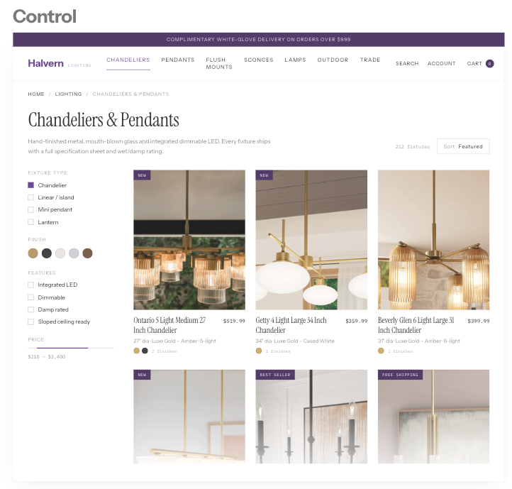
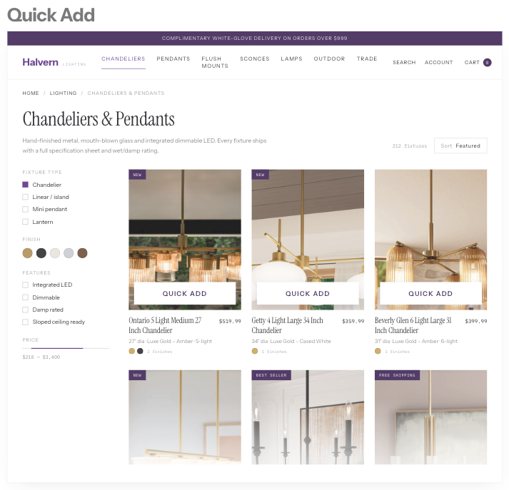
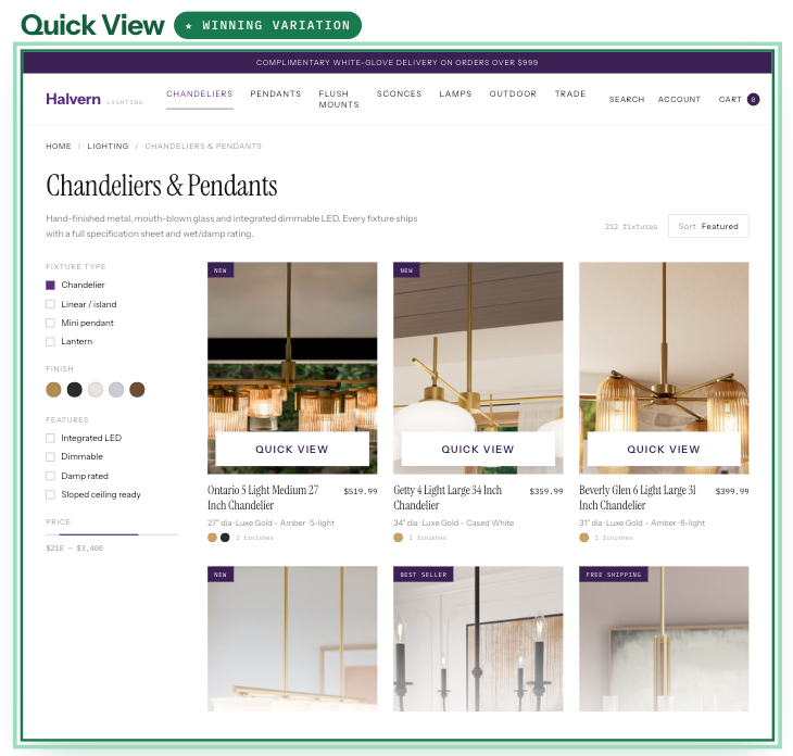
The winning variation: "Quick View" proved to be the winning strategy. For high-consideration products, asking shoppers to "Quick Add" without viewing full specifications was premature.
The Impact:
- +19.0% Revenue Per Visitor (RPV)
- +13.4% Purchase Conversion Rate
Key Takeaways:
- Reduce the right friction. The biggest barrier wasn't adding products to the cart. It was getting enough information to feel confident choosing one.
- Keep shoppers in the flow. “Quick View” allowed visitors to explore product details without leaving the collection page or breaking their browsing flow.
- Design for how people make the decision. While shoppers are still evaluating, helping them make a confident choice can be more valuable than simply making it faster to buy.