Share this article:
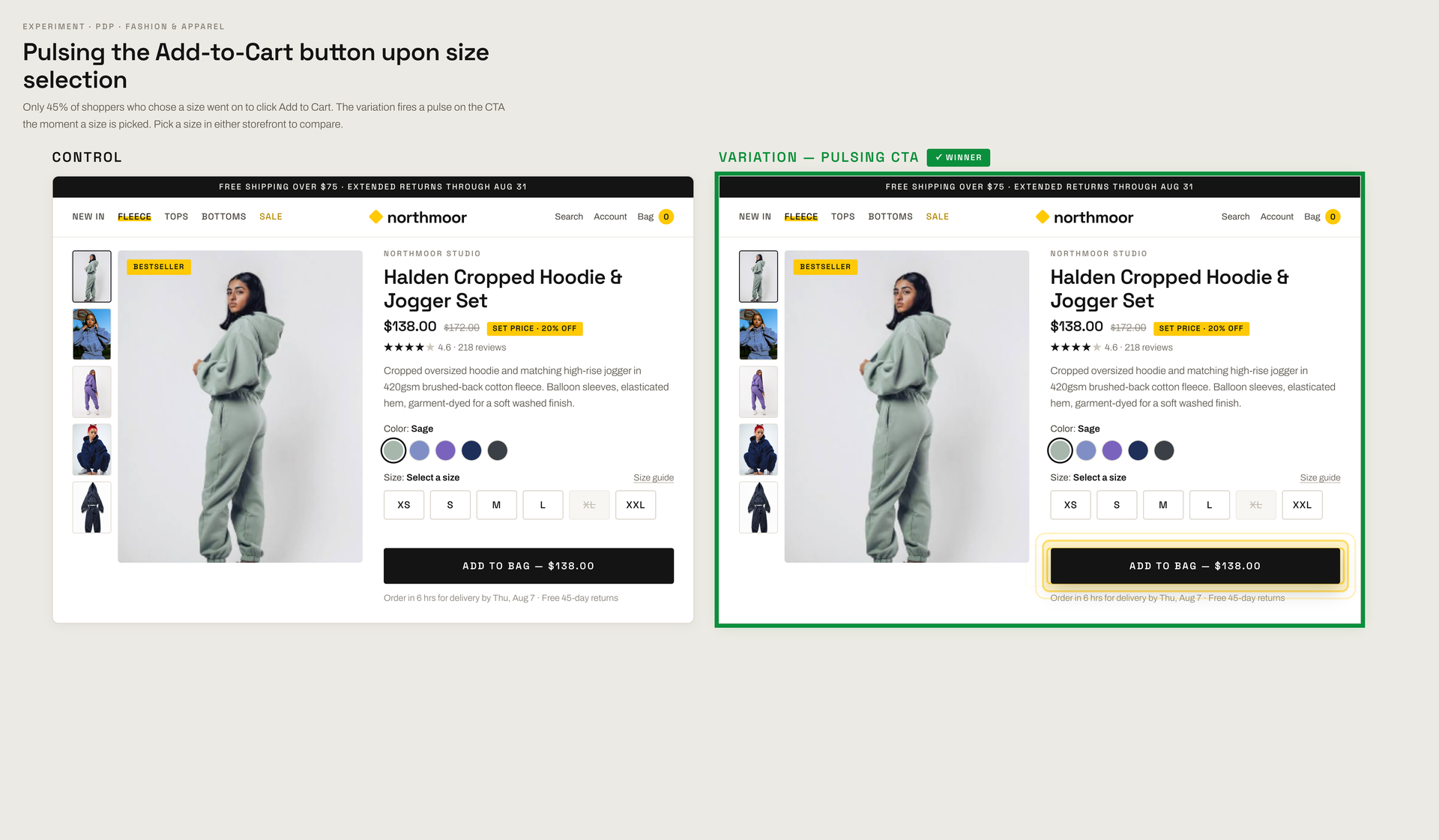
For a leading fashion and apparel brand, selling products that require a size selection before purchase caused visitors to stall far more often than on simple product pages that required no options to be picked. Data showed that only 45% of shoppers who picked a size actually went on to click “Add to Cart”, meaning more than half decided and then stopped cold. To remove friction from this multi-step flow, this experiment tested triggering a visual pulse on the primary “Add to Cart” CTA the exact moment a size was chosen, essentially “reminding” visitors what their next action should be.
Hypothesis: If the Add-to-Cart button draws attention with a pulse animation the moment a shopper picks a size, more shoppers will take the next step instead of hesitating on the page.
What we A/B tested:
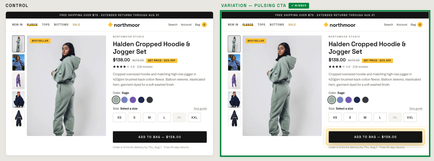
The impact:
- +4.7% Add-to-cart clicks
- +14.5% Revenue per visitor
Takeaways:
- Visual cues timed correctly can do the heavy lifting. We didn't redesign the button, change its color, or rewrite the copy. Adjusting when the button caught the shopper's eye was enough to move the target metric.
- Micro-interactions bridge intent to action. The gap between picking a size and adding to cart is a high-dropoff moment. Adding subtle feedback right when a choice is made guides shoppers into the next step without forcing a site redesign.
- Fix the friction point, not the whole page. You don't always need major structural changes to lift conversion. Focusing strictly on the exact moment shoppers hesitate often delivers the desired impact.