Share this article:
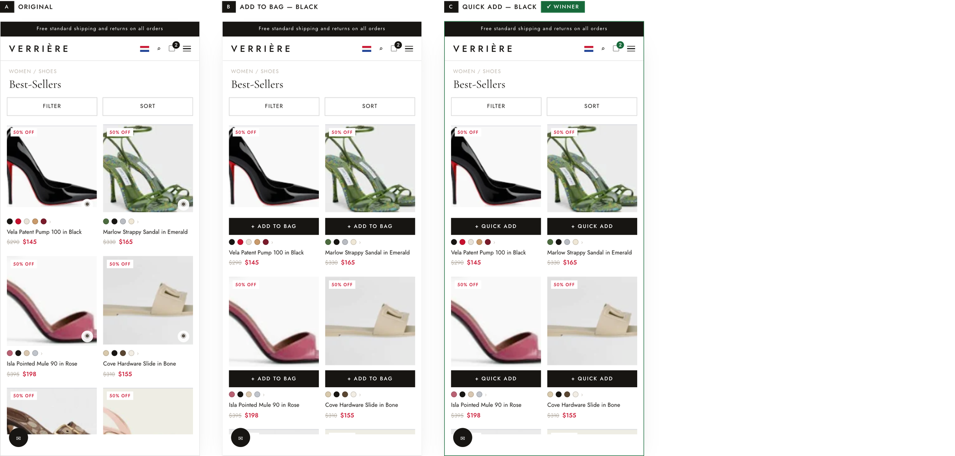
While browsing mobile collection pages for a premier designer footwear brand, shoppers scan a grid of visually similar styles. Although the store already had a quick-view feature, adding a product to the cart required navigating to a full product detail page (PDP). In the original design, fewer than 1.5% of visitors used the small quick-view icon tucked in the bottom right of the image. This experiment replaced that subtle icon with a prominent action bar directly beneath the product image, enabling 1-click add-to-bag functionality straight from the collection page.
Hypothesis: If the quick-view feature is presented as an explicit, 1-click full-width action bar rather than a small, low-prominence icon, shoppers can add items to their bag instantly without an extra PDP click, drastically reducing browsing friction and speeding up intent to purchase.
What we A/B tested:
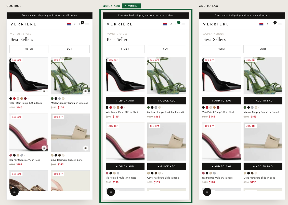
The winning variation: The “+ QUICK ADD” bar won. Upgrading the small, low-prominence icon to an unmissable full-width black bar placed right under the shoe image made 1-click adding immediately obvious to mobile shoppers.
The impact:
- +10.6% Revenue Per Visitor (RPV)
- +8.8% Purchase Conversion Rate
Takeaways:
- Eliminating PDP friction with 1-click buying drives immediate revenue. Forcing shoppers through a full product detail page creates unnecessary steps in high-intent moments. Giving mobile users the power to add items to their bag in a single click directly from the collection grid speeds up buying decisions and directly boosts conversion.
- High-contrast visual affordance drives feature adoption. Shoppers weren't ignoring the quick-view feature because of what it said, but because the original icon was small and low-visibility. Replacing a subtle icon with a prominent, high-contrast black bar directly under the image made the 1-click action impossible to miss and drove a +140% spike in interaction.
- “Higher urgency” copy might perform better, for some brands. For this brand, using the copy “QUICK ADD” outperformed “ADD TO BAG”. This copy likely aligned with the brand’s character - sexy, immediate, and sharp.