Share this article:
On a women's footwear brand's mobile collection page, traditional page-by-page navigation appeared to be creating unnecessary friction. Every time shoppers tapped a small “Next”, a full page reload wiped their visual context, likely disrupting their flow and offering a natural exit point. We tested replacing pagination with a prominent, high-contrast “Load More” button. Designed to be far larger, bolder, and more intuitive on mobile, we aimed to see if this effortless interaction would keep shoppers on a continuous grid, preserve browsing momentum, and drive deeper catalog exploration.
Hypothesis: Replacing mobile page-by-page reloads with a prominent, inline “Load More” button will preserve browsing momentum and eliminate context loss, driving deeper catalog exploration and higher revenue.
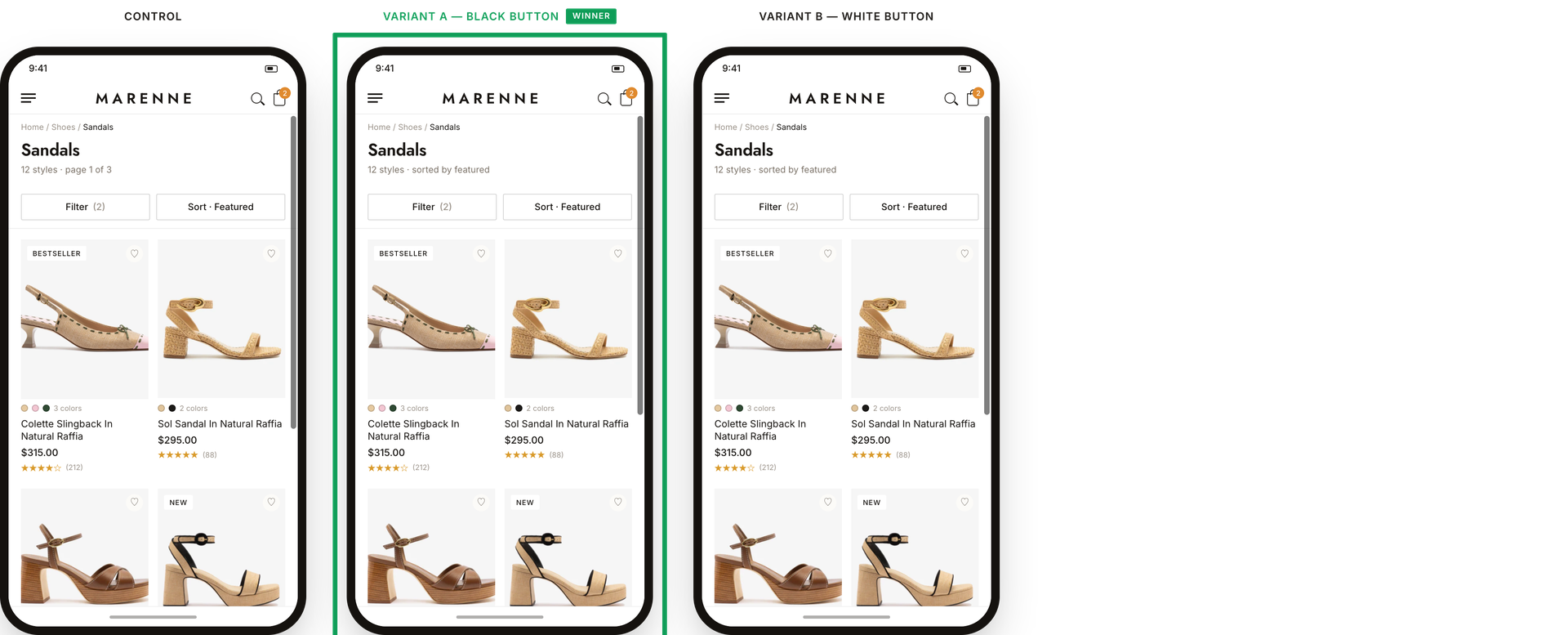
What we A/B tested:
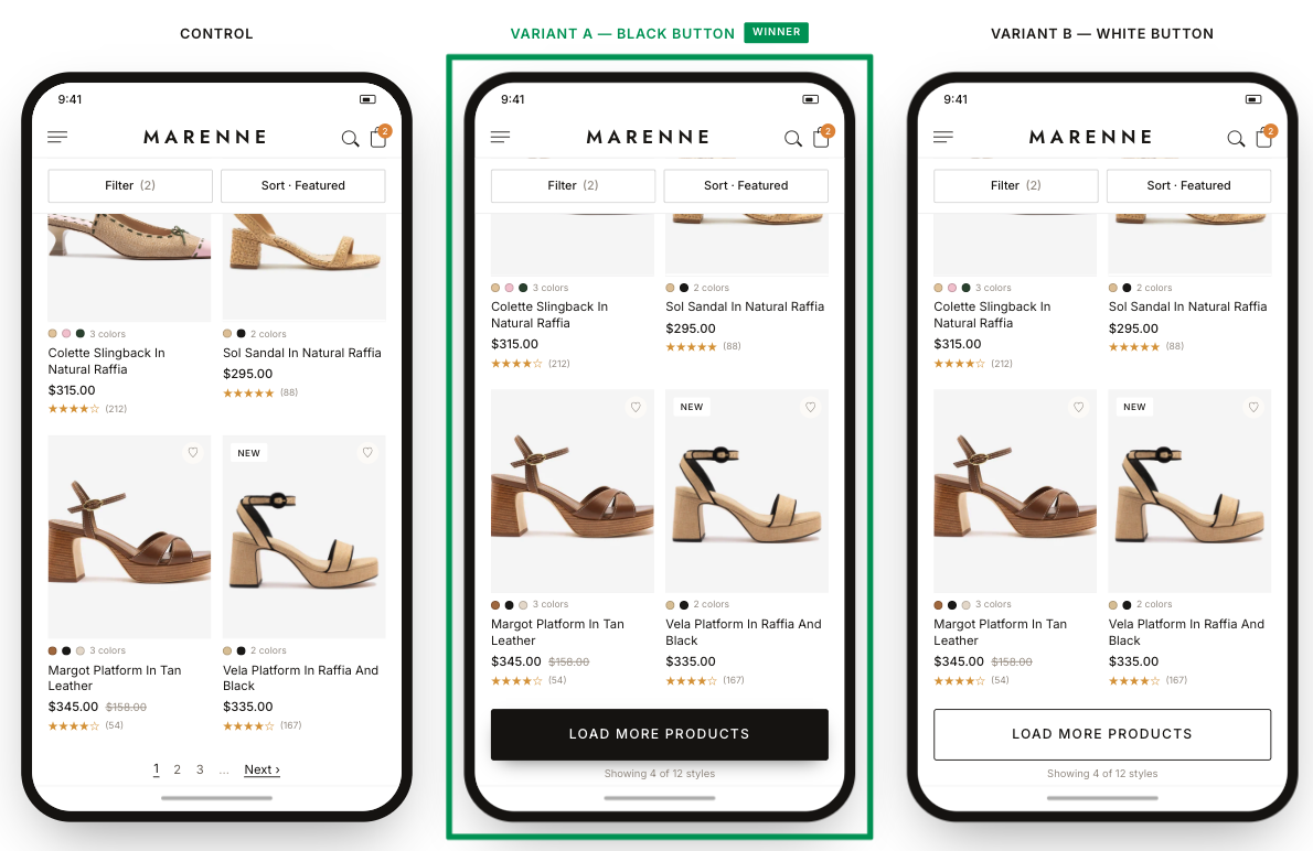
The winning variation: The “black button” variant won. Both variations were used by about a quarter of visitors, but the black button's variant performance showed better performance across board. A likely read is that the black button stood out more against the page, so more shoppers noticed and used it.
The impact:
- +8.5% revenue per visitor
- +6.4% purchase conversion
- +3.5% reached a product page
Takeaways:
- A bolder, simpler interaction option sustains browsing momentum. Tiny pagination links and clunky reloads disrupt a mobile shopper's flow. Replacing them with a prominent, easy-to-tap “Load More” button smoothed out the discovery process, making it instinctive for users to keep exploring and ultimately reach more product pages.
- For this brand, a black button outperformed a white button. A black background button performed better, likely because of its higher alignment with the brand’s design guidelines.