Share this article:
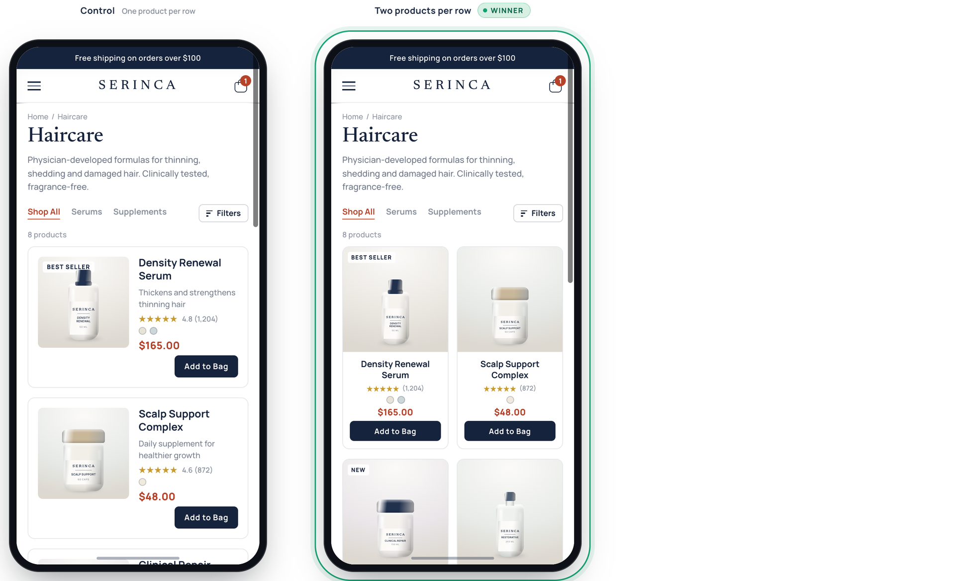
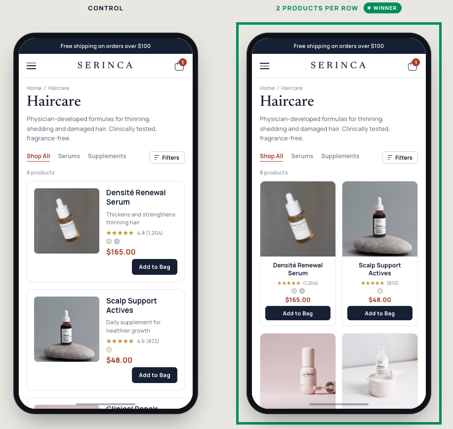
For this clinical skincare brand, mobile shoppers were only seeing two products at a time on the collection page as they scrolled, making product discovery slightly less convenient. The page relied on a non-standard, single-column layout that forced heavy scrolling. Fewer than 30% of collection page visitors clicked on a product. This experiment tested whether switching to an industry-standard two-column grid would lower scroll friction and help shoppers discover more products.
Hypothesis: If we switch the collection page to a familiar two-per-row grid, shoppers will compare products more easily and click through to product pages at a higher rate.
What we A/B tested:
The impact:
- +37.5% product card clicks on the collection page
- +6.3% purchase conversion
Takeaways:
- Increase product visibility to simplify exploration. On small mobile screens, showing multiple products right away reduces scroll fatigue and keeps shoppers exploring, preventing quick bounces.
- Right-size your grid density to your product's complexity. The ideal number of visible products per screen might not be universal; it can depends on how much visual and copy detail a shopper needs to evaluate an item. High-consideration or complex products need larger cards, while simpler or visually driven items convert best in denser grids. Testing screen density against your specific catalog helps you find the sweet spot between fast browsing and informed clicking.

.jpg)