Share this article:
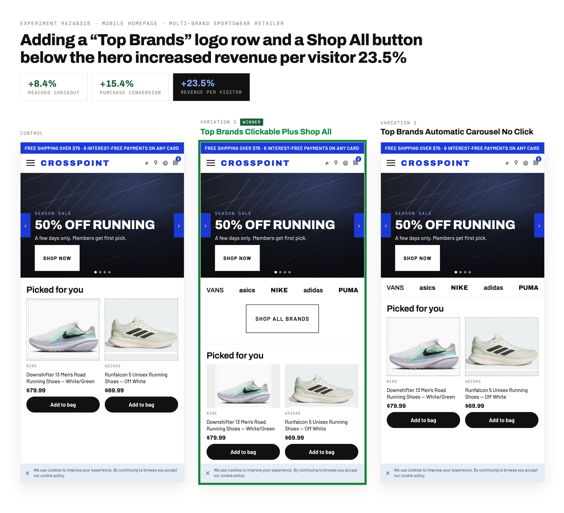
On a multi-brand retailer's mobile homepage, shoppers frequently left without reaching a product listing page (PLP). Site navigation relied heavily on generic hero messaging and hidden menus, creating friction that capped overall catalog exploration. For a store that sells popular third-party brands, the homepage lacked immediate, recognizable paths to the different brands’ catalogs. This experiment tested placing a “Top Brands” section directly below the hero to use well-known brand names as a direct path into the catalog.
Hypothesis: Showing recognizable top brand logos below the hero gives visitors immediate navigation paths into product listing pages, increasing catalog exploration and purchase conversion.
What we A/B tested:
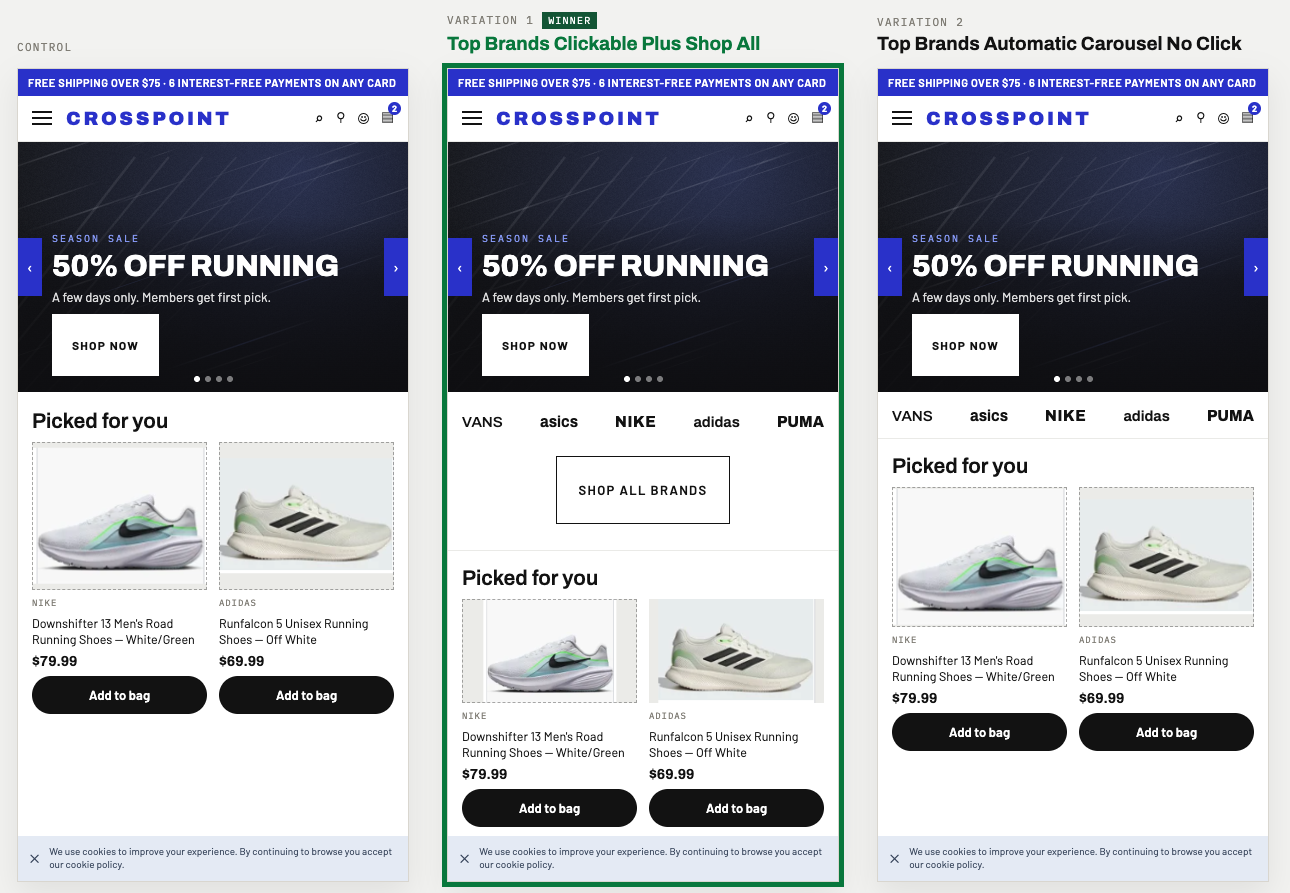
The winning variation: “Top Brands Clickable & Shop All” won. The most likely reason is that adding the prominent “Shop All Brands” button made the section bolder and more visible than the logos-only version. This boosted initial engagement, routing more visitors deeper into the product catalog and compounding conversion down the funnel.
The impact:
- +8.4% Reached checkout
- +15.4% Purchase conversion
- +23.5% Revenue per visitor
Takeaways:
- Use brand names people already know to your advantage. For stores that sell multiple brands, famous logos build instant trust. Making those logos clickable lets shoppers jump straight to products from brands they already like.
- A visible design drives more clicks. Adding a clear “Shop All Brands” button gave the section more visual weight below the hero, making it obvious to mobile users that the area was ready to interact with.
- Give shoppers both specific and general choices. Combining single brand logos with a general “Shop All” button creates two easy paths: one for people looking for a specific brand and one for people who just want to browse everything.

.jpg)