Share this article:
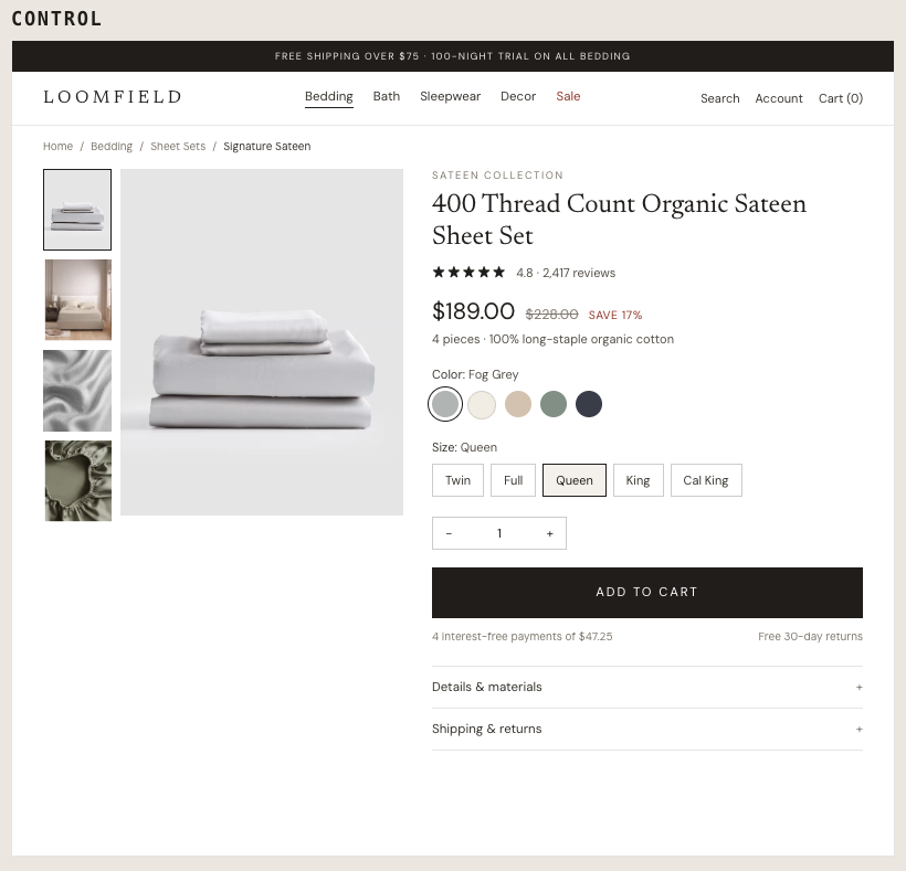
On desktop PDPs for a bedding brand, only less than 5% of visitors were clicking “Add to Cart”. Adding urgency messaging directly next to the primary action is a proven strategy to prompt hesitant shoppers. This experiment tested whether positioning a high-visibility demand signal directly above the Add-to-Cart button would increase engagement and push more shoppers through to checkout.
Hypothesis: Placing a social-proof banner directly above the Add-to-Cart button will communicate live demand at the exact moment of decision, creating urgency that moves shoppers to take action rather than delaying.
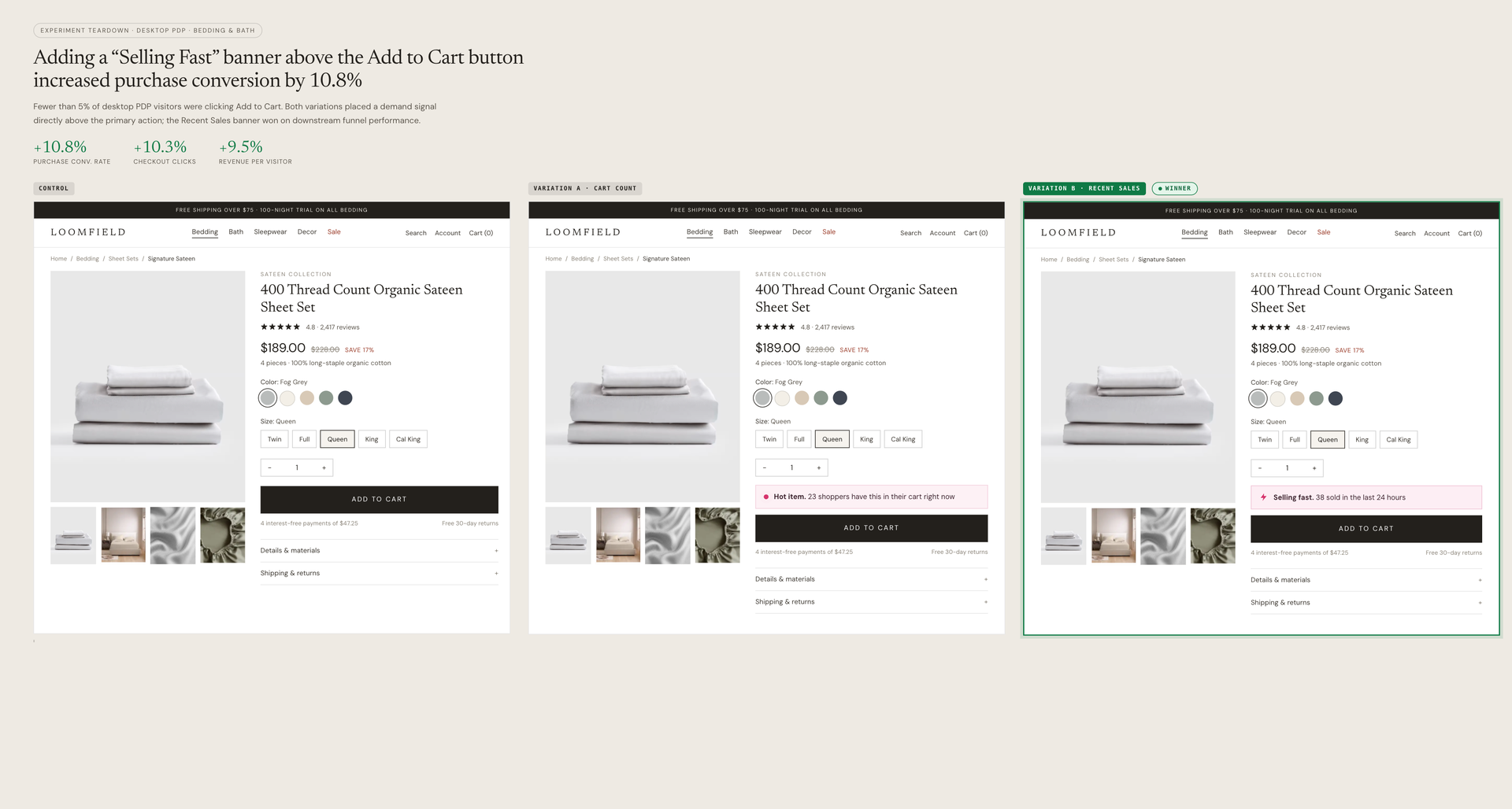
What we A/B tested:
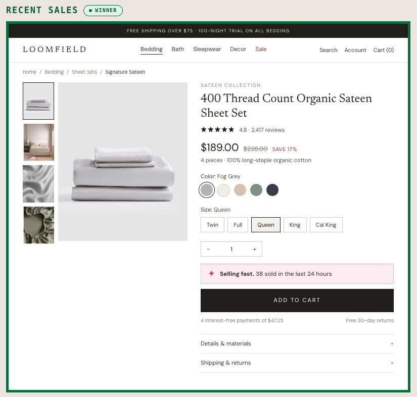
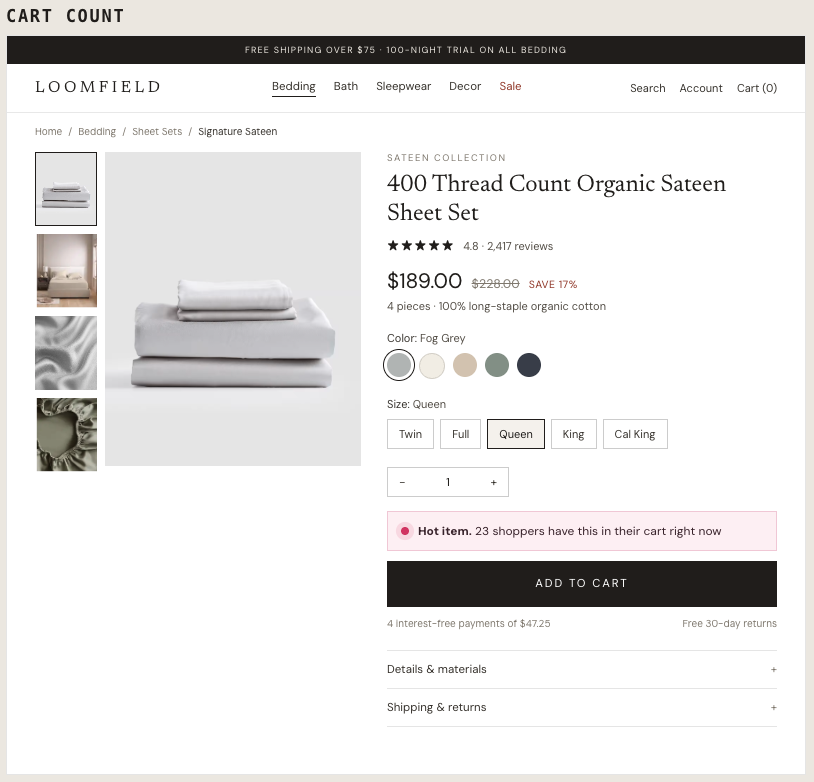
The winning variation: Both variations outperformed the control, but the “Selling Fast” banner emerged as the clear winner due to its better downstream funnel performance. Placing this urgency signal directly above the primary button unlocked significant revenue impact.
The impact:
- +10.8% Purchase Conversion Rate
- +9.5% Revenue Per Visitor (RPV)
Takeaways:
- Placement matters as much as the message. Placing demand signals directly above the primary Add-to-Cart button hits shoppers at the exact moment of decision, driving higher purchase intent.
- Test different types of social proof. “Selling Fast” messaging outperformed cart counts. Don't just test if social proof works; test which specific angle resonates best with your audience.
.jpg)